| Page |
|
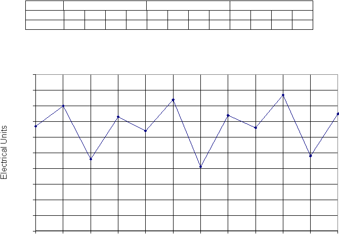
Time-Series Graphs
Time-series graphs show a quantity plotted against time, such as a baby’s
weight in the weeks following birth or the amount of electricity used in a house.
The house electricity meter is usually read every quarter (3 months). The table
shows the units of energy used each quarter in a typical house, for a period of 3
years: 2000, 2001 and 2002. The data are plotted against time, measured in
quarters, with the varying quantity (the electrical units) plotted on the y-axis.
Year
2000
2001
2002
Quarter
1
2
3
4
5
6
7
8
9
10
11
12
Units
670
800
460
730
640
840
410
740
660
870
480
750
Time-Series Line Graph for Household Electrical Use
0
100
200
300
400
500
600
700
800
900
1000
1
2
3
4
5
6
7
8
9
10
11
12
Quarters
The graph is a line graph: the plotted points are joined by straight lines. A time-
series graph can show two things:
1. Cyclical Variations: the graph shows a pattern called a cycle: the pattern is
seasonal. There is a large seasonal variation through 2000 (quarters 1 to 4).
The pattern repeats itself in the following years. The use of electricity
increased at the start of year 1 (quarters 1 to 2) and then fell. This repeated at
the start of year 2 (quarters 5 to 6) and so on.
2. Underlying Trend: the large seasonal variation in the electricity used may
hide an underlying trend in the data from year to year. If you look carefully
you can probably spot a small increase in the average use of electricity from
one year to the next.